
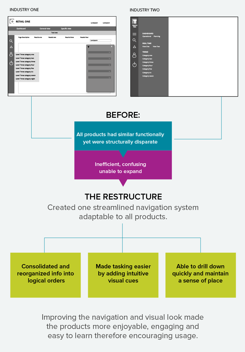
A global technology leader developed a suite of data visualization tools to help industry verticals gain insight into customer’s behavior. The software was highly sophisticated but a better user experience was needed to attract potential clients.
Planning for success
1. Performed vigorous testing to evaluate overall experience and identify usability issues
2. Evaluated a range of related interactive data visualization products in marketplace
3. Presented findings and test results to team for consensus
4. Reorganized content maps into logical hierarchies
5. Wireframes created to prove that the global navigation and all use cases were bullet-proof
The Redesign
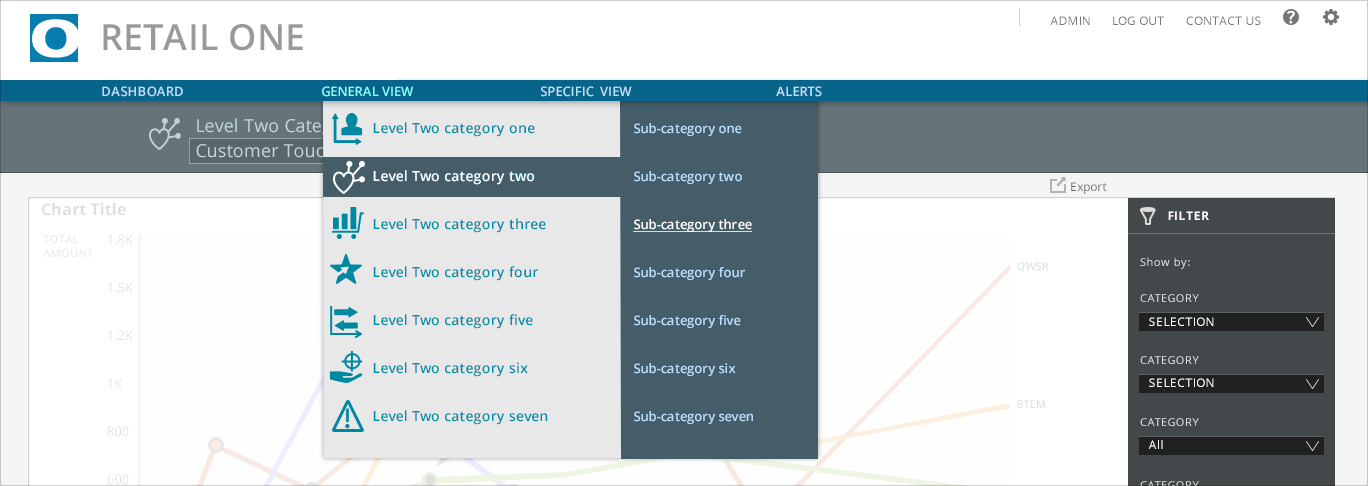
Drop down menus with icons allow quick access to multiple categories

To streamline tasking in a section with focused interests a sub-navigation model with tabs was designed
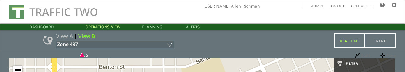
The suite's navigation structure was designed for flexibility. It's able to scale and accommodate add-ons such as toggle views as in this product above. The visual look was designed so the mast head and color system could be adjusted to accommodate any clients' brand standards.
Telling stories in real time
Visualization models were designed to best convey data relationships specific to industry inquiries so users can quickly understand trends and see patterns in real time. Designed for simplicity, interactive controls allowed uses to refine dimensions to help in their analysis.
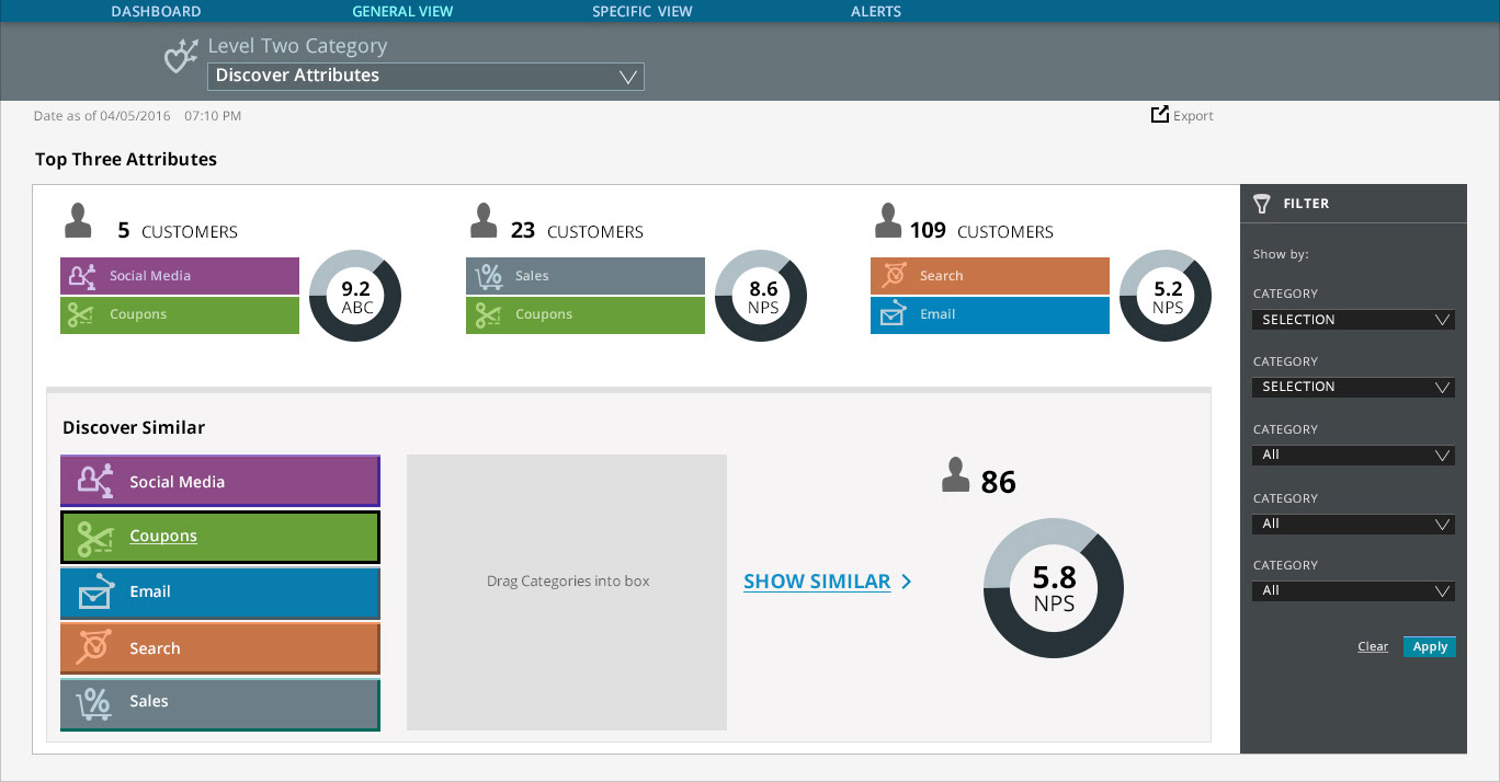
Simple game-like drag and drop functionality allows uses to understand customers' behavior. Filters were designed to always be available allowing users to granularly refine their inquiries.
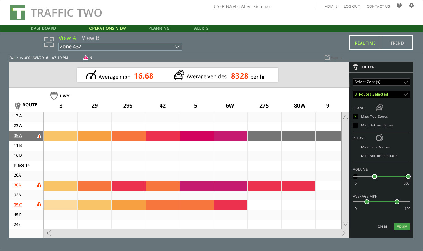
A heat map model was designed to show areas of high alert in a system. Users can refine inquiries by filtering, selecting an alert to learn more or accessing links to drill down deeper into details.
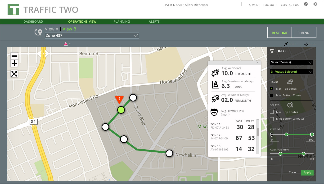
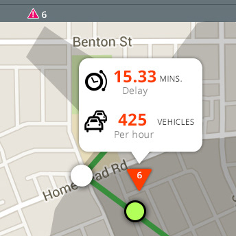
Users can discover trends in areas of a transit system by filtering inquiries. A pop-up shows results. They can also click on an alert icon to see real time incidents.

Interactive dashboards designed to help users gain insight into top level trends. Users can click on data to view details.
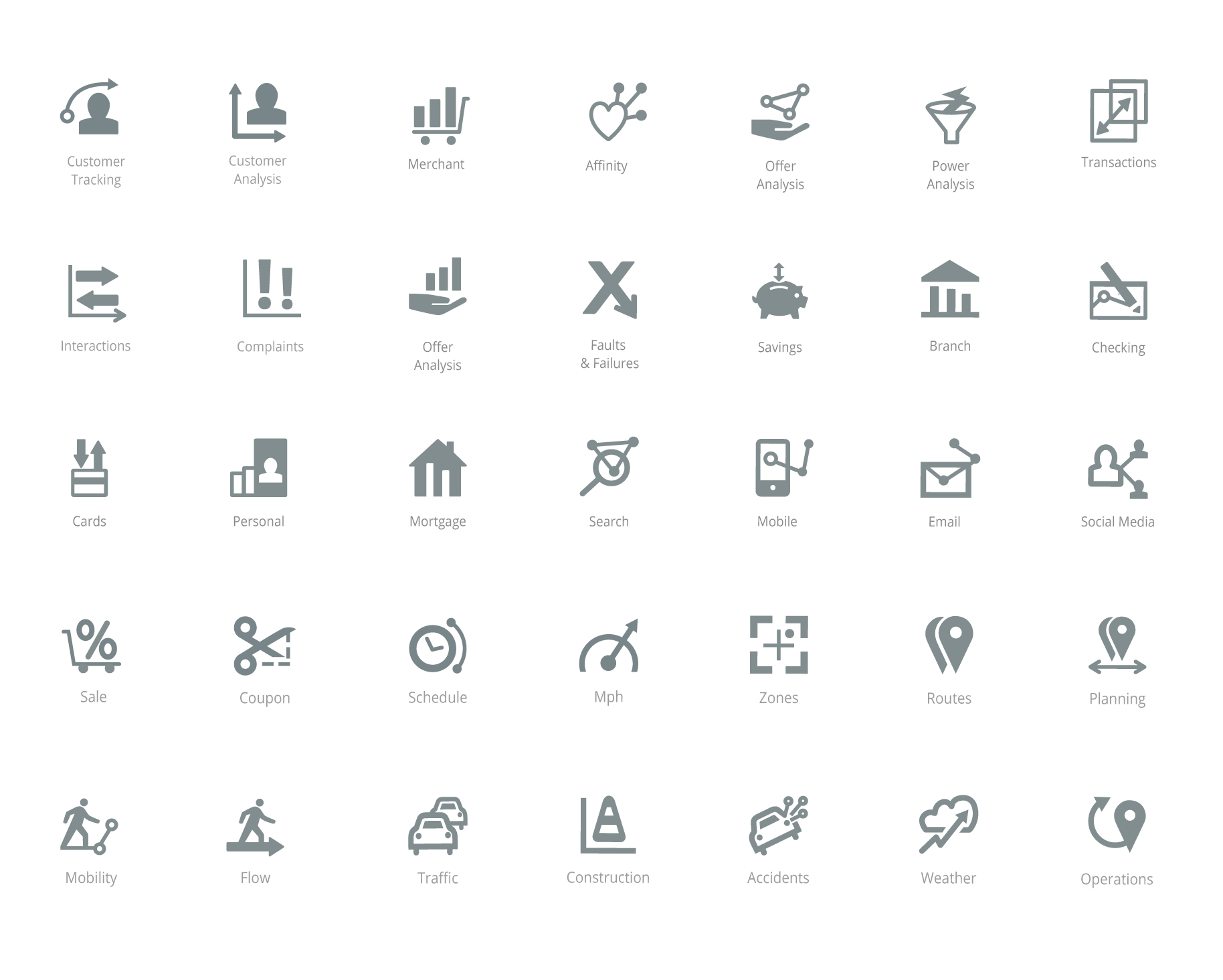
Sets of industry-related icons created with analytics theme